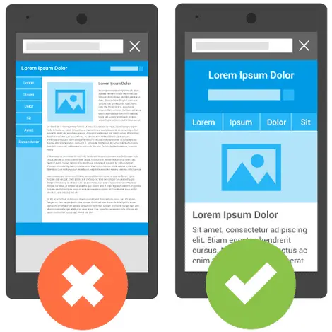
With mobile technology on the rise, we spend more time on our mobile devices, reading news on the go, browsing interesting websites, and even shopping. According to Review 42, 80% of smartphone users favor brands with mobile sites and apps that are easy to navigate.
The bottom line: You need a mobile friendly WordPress theme
See how to test if your website is mobile friendly and how to optimize your WordPress site for mobile devices. We will also take you through the steps to ensure your website visitors get an optimal user experience when using a smartphone.
Is Your WordPress Site Mobile Friendly?
Use these tools to determine how mobile friendly your WordPress site is.
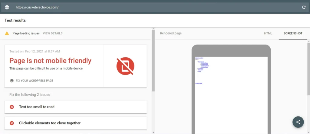
Google Mobile-Friendly Test
The first tool comes straight from Google and is simple and straightforward. Open your browser, go to Google Mobile-Friendly Test, enter your website’s URL, and click Test URL. It will tell you if your website works well with mobile devices or not.
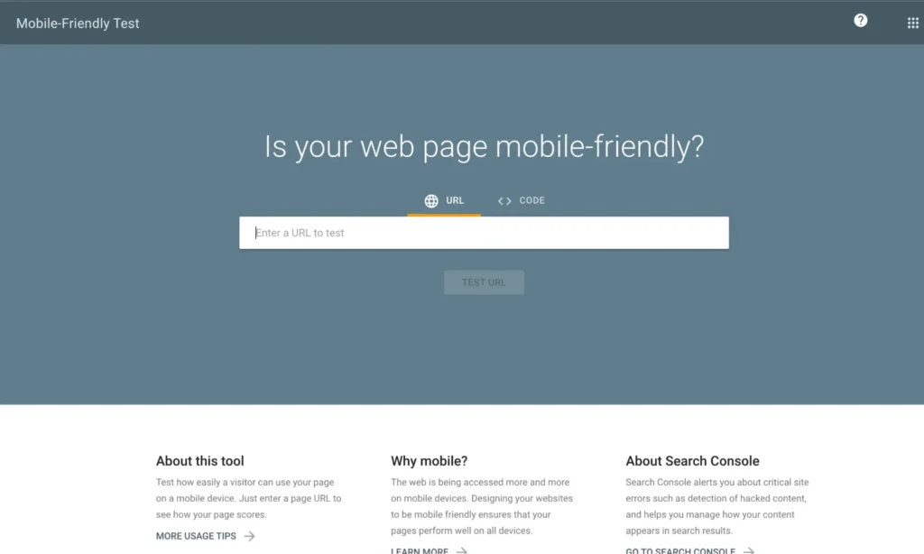
If it’s not, the test will indicate which errors are causing problems and guide you toward helpful resources to make your site mobile friendly.
MobileTest.me
The other tool is MobileTest.me. This tool allows you to pick a specific mobile device, and after entering your website’s URL, you can see how your website appears on that particular device.
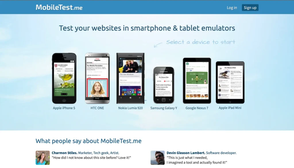
What makes this tool stand apart from the other one is that you can interact with your website as if you are browsing from that specific device. This is a great way to see how your site works on mobile devices and test common elements like sharing buttons and sign-up forms.
How To Optimize Your Mobile Friendly Website
Even if your website appears mobile friendly on multiple platforms, it may not be completely optimized. In most cases, website owners will only test the homepage, which might appear mobile friendly. But once you start digging a little deeper, you might discover some potential issues.
For example,
- Can your website visitors click on the sharing buttons?
- Is your sign-up form difficult to close, making your website hard to scroll and see?
- Can your products be bought using a mobile device?
- Are the input fields big enough to see what you are typing?
Add social sharing buttons
There are many social sharing plug-ins available for WordPress, but not all are optimized for usage on mobile devices. In the hope of encouraging visitors to share your content, most will allow you to display social sharing buttons above or below the content, or as a floating sidebar.
In most cases, those buttons either take up more screen real estate than what’s available on a mobile device, or if you use a floating sidebar option, they cover your content. To solve this, check the plug-in settings and disable the floating sidebar on the mobile view. If there is no such option, disable it altogether.
If your current social sharing button doesn’t perform well on a mobile device, consider using a different plug-in such as Sumo, a free one with a floating share bar that automatically displays on the bottom of the screen when it detects a visitor using a mobile device. Another great option is Social Warfare which resizes all sharing buttons according to the screen size and lets you disable the floating share buttons entirely on mobile devices.
Check email opt-in forms
A pop-up plug-in is one of the most effective ways to grow your email list. Unfortunately, many take up too much screen space on mobile devices, making them impossible to close, or they are so small the user cannot read the text or fill out the required fields. If you are using a pop-up plug-in, be sure to test it on various mobile devices carefully.
In case you need to find a plug-in that will display properly on mobile devices, you can explore the following WordPress plug-ins we think are the best. Sumo works well on mobile devices, and it’s free.
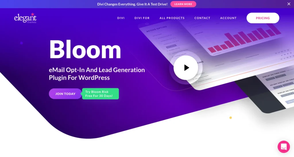
Another option is Bloom — a premium plug-in developed by Elegant Themes (if you invest in Bloom, you will get access to their entire suite of themes). Optin Forms is another free plug-in that is responsive and displays without problems on mobile devices. It offers five different opt-in form designs that you can apply to your posts, pages, and widgets via shortcodes.
Small business owners can consider the HubSpot WordPress plug-in. It’s free and provides forms, pop-ups, live chat, and analytics. Also, it integrates with the free HubSpot CRM (contact database), making it easy to manage your leads and send automated email responses when an individual fills out a form.
Optimize for e-commerce
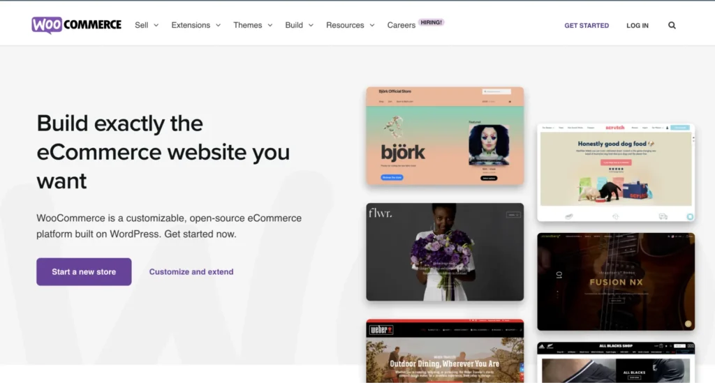
If you run a small business website and rely heavily on WooCommerce, it’s crucial your store displays and functions the way it should on mobile as well as on the desktop. And if you built your website using one of Woo’s themes, chances are your store is mobile friendly. The developers behind WooCommerce and WooCommerce Themes have been building responsive themes since 2011, so websites using their themes shouldn’t have any issues.
If you went a different route, like buying a theme from a theme marketplace, or having a custom site developed, then you have two options. First, you can contact your web designer and have them make sure your online store is optimized for mobile use. This means your product images scale depending on the screen size without appearing cut off, the shop buttons don’t extend over the allowable screen size, and the input fields on the order form trigger the correct keyboard for the right field.
The second option is to install a mobile friendly plug-in such as WPtouch Pro or Jetpack’s theme module. But the downside of this approach is that your website will look different on varying mobile devices.
Embed objects with a set width and height
If you’re embedding YouTube videos or infographics on your website, you’ve probably noticed they have a set width and height. This might hurt the experience for your mobile visitors, so the best way to ensure this doesn’t happen is to follow these tips that explain how to embed external content on your website correctly.
Avoid slow loading times
A slow-loading website will ruin your visitors’ experience on regular computers and mobile devices, especially for those who don’t have generous data plans. Several minor tweaks, like minifying (changing code to remove unnecessary characters and elements) your style sheets and JavaScript files, and minimizing the number of plug-ins you use, can speed up your website. Also, optimize images before you upload them to the site.
Using a caching plug-in and investing in a content delivery network (CDN) and a good hosting company will make a massive difference in your website’s slow load time and increase the chances of your mobile visitors sticking around.
Aside from these issues, you can do a few more things to make sure your website is mobile-responsive. The first and most obvious solution is to use a responsive WordPress theme. Paid solutions include Genesis Framework, whose child themes have a responsive design and are out of the box. We use Altitude Pro, but there are free child themes too.
Suppose you’re not keen on switching themes yet; in that case, you can optimize your WordPress website using mobile optimization plug-ins such as WP Mobile Detector that deliver a mobile friendly version of your site. Another plug-in that will help you optimize WordPress websites for mobile is Any Mobile Theme Switcher.
Google’s Accelerated Mobile Pages Initiative
Google’s Accelerated Mobile Pages (AMP) is an open-source initiative that aims to improve the world of the mobile web. See below:
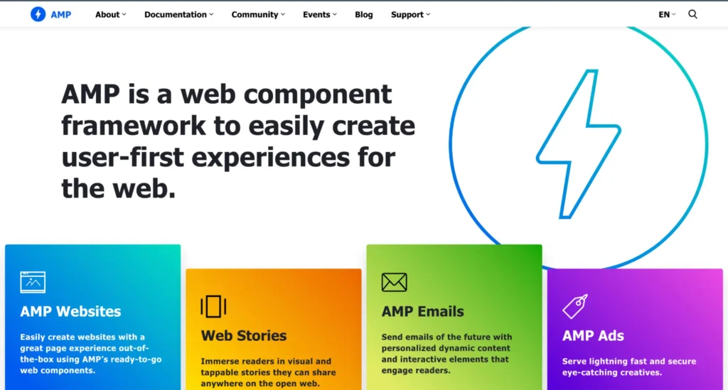
The AMP project relies on AMP HTML — a framework that allows websites to build lightweight web pages. Essentially, it strips out most of the elements which cause web pages to load slower on mobile, like JavaScript and third-party scripts. Some big names like Twitter, WordPress.com, Pinterest, Adobe Analytics, and LinkedIn have already accepted this initiative and are collaborating with Google to make the mobile web better for everyone.
Under the AMP initiative, mobile-ready pages will appear higher in search engine rankings and get highlighted with a little green lighting bolt, inviting users to visit them. Google has already made a tutorial that walks you through creating an AMP page, making it easy to get started.
This doesn’t mean you have to abandon WordPress to rank higher in search engines. All you have to do is install the AMP plug-in. With the AMP plug-in active, all posts on your site will have dynamically generated AMP-compatible versions, guaranteeing a positive mobile user experience.
Strive for Browsing Satisfaction
Having a mobile friendly WordPress website can make a significant difference between your business attracting new customers and clients or sending them to your competitors. The best way to ensure your WordPress site is compatible with mobile devices is to follow the tips and practices outlined in this article.