
Mobile-first indexing has changed the way Google determines site rankings. In addition to checking your browser site with Googlebot Desktop, the search engine also crawls ― and prioritizes ― the mobile version of your page with Googlebot Smartphone. Now more than ever, ensuring that your visitors’ mobile experience is included in your site’s SEO (search engine optimization) strategy is important.
The most significant element of the mobile user experience is page speed. You may need to tweak your site for better loading on devices relying on 3G (generation), 4G, or 5G connectivity. A speed considered fast on a hardwired desktop is much different than the small phones and tablets your customers hold in their hands.
Key takeaways:
- Site speed directly correlates with bounce rate, with faster websites keeping audience attention for longer.
- Google’s switch to mobile-first indexing means your website needs to be optimized for expedient loading on smartphones and tablets over desktops.
- Several excellent options for testing your website’s loading speed are available to help you spot any potential slowing points so you or your web developer can fix them.
What Is Mobile Page Speed?
Mobile page speed simply means how fast your page loads on a mobile device, which covers smartphones and some tablet models. Most site speed analytics tools default to the desktop version of your site.
While this is helpful, the mobile version’s experience is what you’re concerned about, particularly Googlebot indexing.
Mobile site speed looks at the following elements:
- First content paint
- Largest content paint
- Time to interact
- Total blocking time
- Cumulative layout shift
- JavaScript
- Render blocking resources
- Server response time
With so many variables at play, you need to review your site’s performance to ensure an ideal user experience.
Why Is Mobile Speed Important To Check?
Mobile phones generated 49.78% of all web traffic in 2023. Google has also switched its search results to prioritize mobile-first indexing, meaning that your site is primarily judged on the mobile version over the desktop version.
Without proper maintenance, you may find your site’s traffic declining due to poor optimization on the mobile version of your site. Paying close attention to your site’s health with well-established speed optimization tools enables you to enhance the user experience on both mobile and desktop iterations.
Free Tools To Check Mobile Speed
The easiest tool for checking your site’s mobile speed is Google Lighthouse, which allows you to audit a specific page’s performance for free.
Lighthouse can provide you with a large array of recommendations, including SEO. For today, we are only interested in our mobile site speed.
Right-click (control + click on Mac) on the inspect tool. By default, this opens the Elements tab. Hover over to the Lighthouse tab, and you’ll see the following:
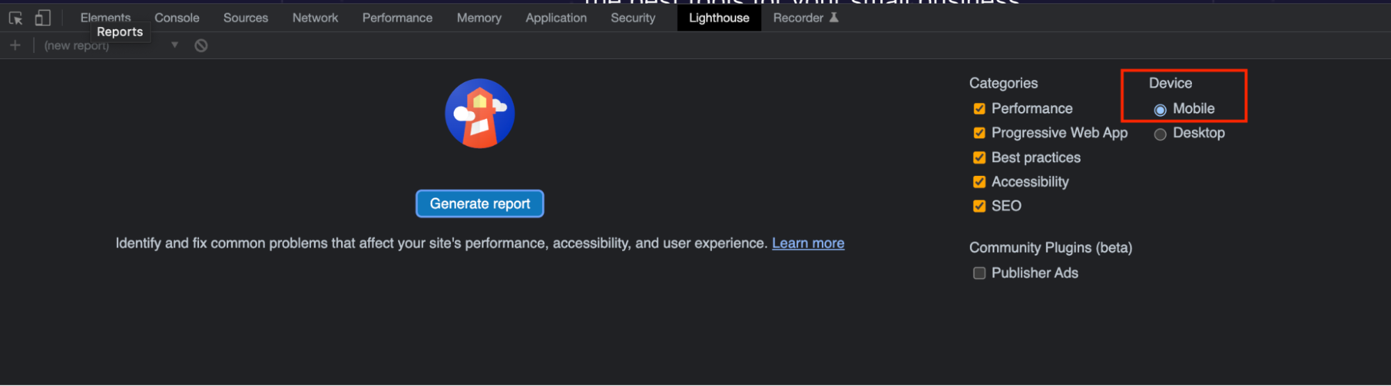
Be sure to check the devices listed and click on Mobile if it’s not already selected. From there, generate your report.
Lighthouse analyzes your web page and provides you with an overall score for the categories you selected. The tool also provides a unique score for each category:
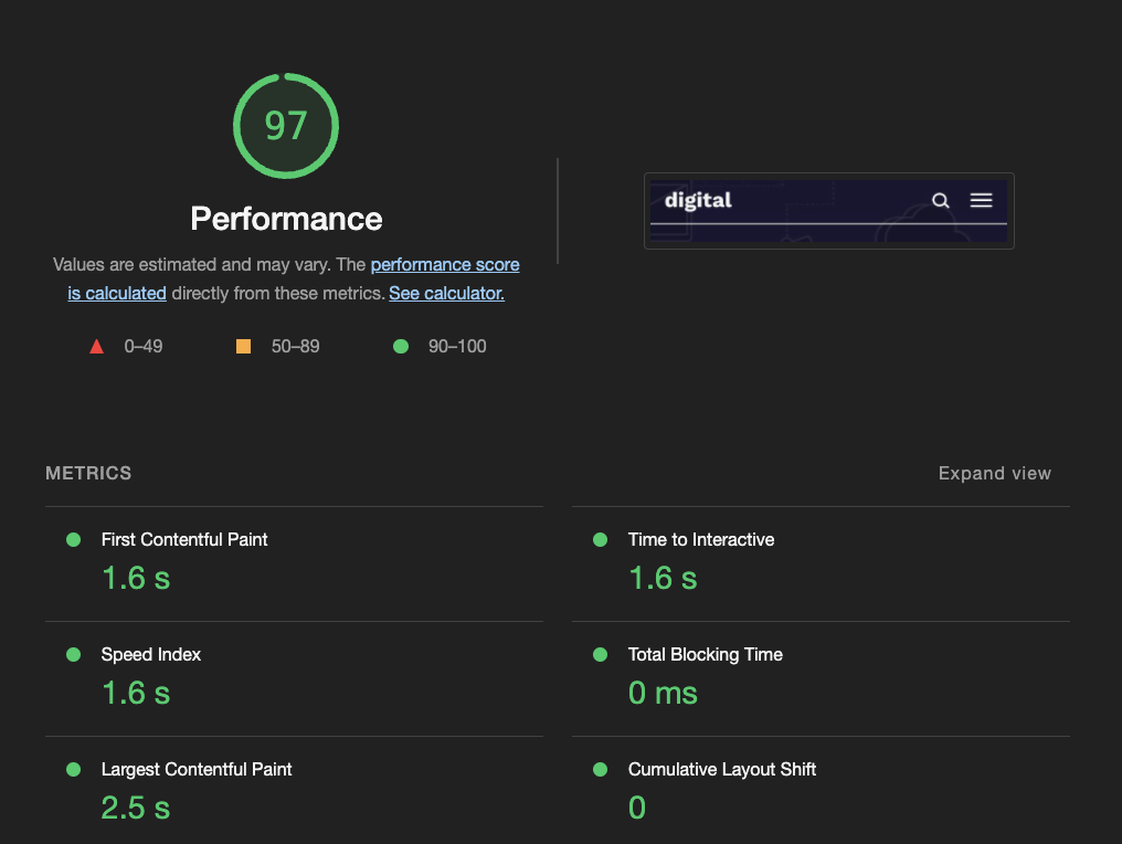
From here, you see a metrics tab with all of your various results. For example, Whoishostingthis.com scored a 97, which indicates that we’re very well optimized from a performance perspective:
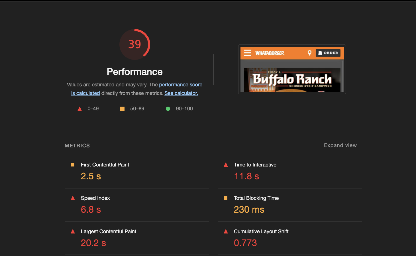
If your site’s not optimized for mobile, its performance may be more similar to Whataburger, which scored a 39. It takes their mobile site 11.8 seconds to interact with the user, so they experience a higher number of bounces due to their comparatively slower mobile experience.
How do you fix this?
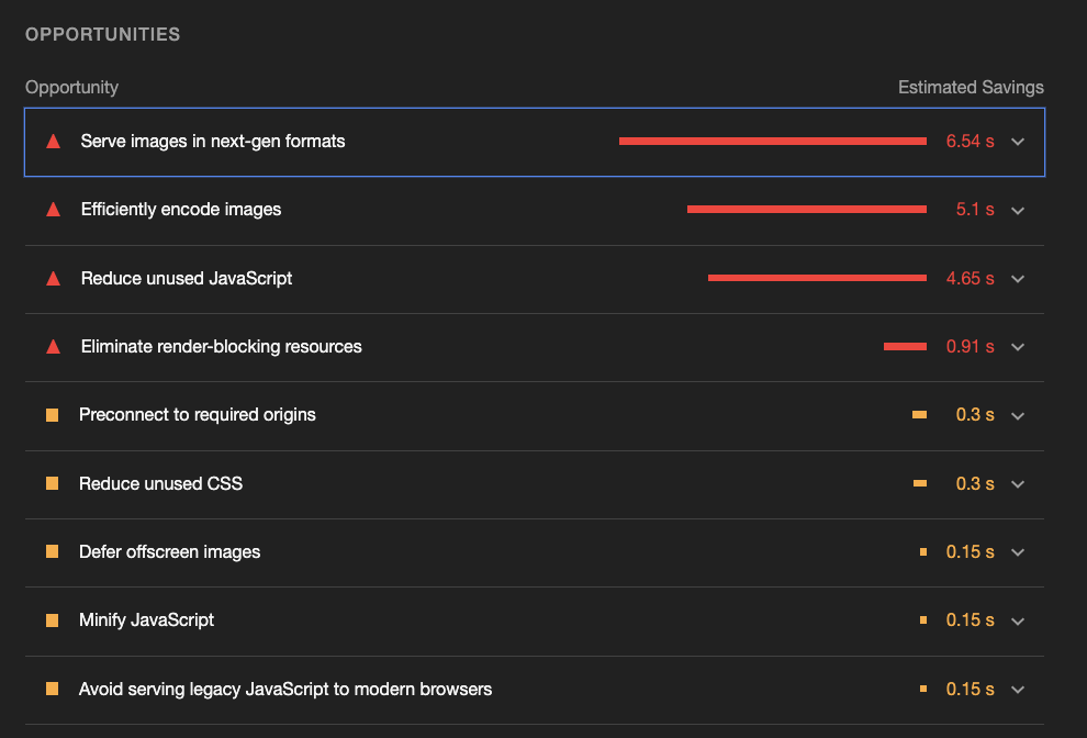
Below your scorecard, you’ll see a section labeled “Opportunities.” Click on the carrots to generate a list of all updates available to better optimize your site. In this case, many of the images are fairly large. Reducing these to next-gen formats or lowering the quality of an image may allow for an improved mobile experience.
Lower-resolution images on mobile do not appear to be of a poor quality due to the smaller screen size. Speak with your web developer to learn about your options for mobile users.
For another Google tool, check out “Think with Google.” It provides you with a quarterly trend report, recommendations on improving your speed, how your site compares to competitors, and, most importantly, an ROI (return on investment) evaluation for improving your website’s loading speed. Download your site’s full report for the most comprehensive review.
If you use WordPress as your content management system, there are various additional tools for helping your site be more mobile-friendly.
Paid Tools To Consider for Mobile Speed
Lighthouse and Think with Google are more than sufficient for most of the mobile optimization changes you may need to make.
You may want to invest in a tool like Mobile SEO Page Analyzer from Pure Oxygen Labs if you’re looking for a more robust analysis. Its SEO feature lets you check your mobile pages for proper canonical tags, headings, and other responsive design elements.
For more traditional SEO tools, SEMRush (Search Engine Marketing Rush) and Ahrefs both conduct their website audits using a mobile crawler. While these won’t give you information on your site speed, they will report on many crucial elements when optimizing it.
Crawling the mobile version of your site spots any broken elements on a responsive design. Be sure to update the crawl settings on these tools before using them.
Pro tip: While it may seem unwise to purchase a paid tool for mobile speed, having one is advantageous if your budget allows it. They focus on auditing the changes you’re making to increase your page speed.
Since there are so many moving parts to a responsive site, these tools can help ensure you’re not breaking various components.
What Does a Good Mobile Page Speed Look Like?
Google hasn’t commented on good mobile site speed recently, but you can assume that their targets are even faster than the two seconds they once recommended.
Another reference point is the time in milliseconds to the average Google position. A 2020 study conducted by Backlinko included more than one million websites. Brian Dean reported, “The average Google first page result loads in 1.65 seconds. However, we found no correlation between site speed and Google rankings.”
These findings may make it appear that mobile page speed is irrelevant. However, when you consider the sites that typically rank in top positions, it makes sense why page speed doesn’t positively correlate with ranking.
The pages ranking in the top positions are most likely well-optimized for SEO. The expertise needed for ranking content high on the SERP (search engine results page) usually comes with an understanding of the importance of site speed. So when it comes to analyzing top results, the playing field should be fairly equal.
The takeaway: While loading speed may not be correlated with Google ranking, you can assume that your competitors on page one are coming in at or below the two-second mark. The results in the top positions are the best because they tick many of the technical boxes.
What To Do First When Optimizing Mobile Page Speed
First, you should start with a Google Lighthouse report, followed by a Think with Google crawl of your domain. Review your site speed score, see what improvements can be made, and take care of them yourself or hire a professional web developer.
Once you’ve addressed the elements in question, re-run the diagnostic. Look at how (or even if) your score has improved. If it was a sizable change, check your analytics dashboard for a comprehensive report.
For more complex optimizations, contact a web developer for assistance, or read our Seven Effective Mobile Optimizations Tips. You may need to incorporate responsive site design, server-side rendering, or lazy loading to bolster your site speed.
Google AMP (Accelerated Mobile Pages) is another great way to speed up your website. Keep in mind that a better site structure almost always outperforms Google AMP, however. Google AMP provides a solid start, but isn’t a perfect solution.
Frequently Asked Questions About Your Mobile Site Speed
What is the ideal website loading time
What can slow your mobile site speed?
The list of things capable of slowing down your website’s loading speed is almost as long as the list of website elements. Superfluous code, high-resolution images, an overload of audio or video, too many plugins, visual clutter, and a plethora of other factors can all be responsible.
That’s why it’s so important to use a tool to check what specifically is making your website slow down. Most of the time, the culprit isn’t any one thing ― it’s several different issues that are causing the problem.